The Obama Track Record on Employment
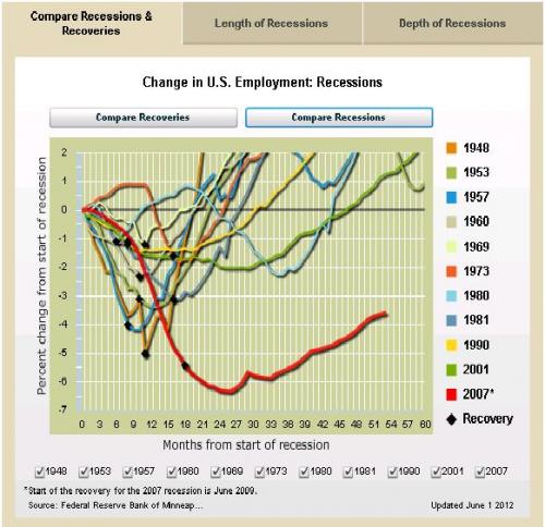
The chart, from the Minneapolis Federal Reserve, speaks for itself. The lines show the unemployment picture from the start of each economic recession, beginning in 1948. The red line on the bottom of the chart shows the most recent recession and provides a devastating indictment of the Obama administration's fiscal policies.


No comments:
Post a Comment